Case Study:
Demystifying Medicare Decisions
A Fortune 300 insurer needed to reinvent its Medicare Advice Center after years of low engagement, customer confusion, and poor online conversion. The existing tool forced people through rigid yes/no questions, often leading them toward recommendations they didn’t understand — or didn’t trust. Drop-off was high, re-engagement was low, and customers frequently abandoned digital and went straight to call centers.
I led the redesign end-to-end, from concepting and algorithm modeling to research, prototyping, testing, and partnership with marketing. The goal was simple: make Medicare feel understandable, personalized, and human. By grounding every decision in user insight — and partnering closely with engineering, marketing, compliance, and product — we transformed a high-friction process into a trusted experience that increased engagement, repeat visits, and online enrollment.
Overview.
The Challenge.
The legacy Advice Center suffered from:
Oversimplified, Binary Question Flow
The original tool forced customers into rigid yes/no questions that didn’t reflect real Medicare decision-making. With no context or explanation, most users felt the questions were irrelevant or incomplete.
High Drop-Off From Confusing Flows
Lack of clarity, context, and transparency led users to abandon the Advice Center midstream — weakening the ROI of a major upper-funnel asset.
Low Trust in Recommendations
Because the tool produced a single recommendation with no transparency, customers believed it was pushing a company-preferred product. Many re-answered questions to “game the system,” further eroding confidence.
Limited Re-Engagement Signals
The experience captured minimal user information and had no meaningful follow-up journey. If customers dropped off, there was no reliable way to bring them back.
An Experience That Didn’t Feel Human
The flow didn’t account for the real questions, worries, or priorities people bring to Medicare decisions. Without space for nuance, users didn’t feel understood or supported.
Compliance + Vendor Misalignment
The vendor didn’t understand the compliance landscape, which forced the team toward oversimplified, risk-averse designs. This stifled innovation and weakened the overall experience.
The common thread was unmistakable: people didn’t feel seen, supported, or understood. Our redesign would have to change that.
Team Structure.
My Role — UX Visual Architect
I led the experience strategy and core design for the Advice Center, turning a confusing, low-trust decision flow into a clear, supportive consumer experience. Working with product, engineering, marketing, actuarial, and compliance partners, I translated complex Medicare rules into an interaction model that felt human and easy to navigate — including designing the recommendation algorithm that powered the final plan scoring.
My role centered on three things:
Defining the experience vision and shaping it into a cohesive end-to-end flow
Guiding research and iterative prototyping to validate the algorithm, questions, and comparison patterns
Aligning stakeholders so the final solution balanced accuracy, trust, and regulatory constraints
I also delivered the final high-fidelity prototype, giving engineering clear direction on workflow logic and interactions, and ensuring we launched a polished, compliant experience users could understand and trust.
Team Composition
I partnered with a small but highly collaborative cross-functional team spanning research, design, engineering, business analysis, and product. Together, we operated as a tight pod that moved quickly, validated often, and balanced user needs with compliance and technical constraints.
Experience & Research
Lead UX Designer (me), Senior UX Researcher, Junior UX Designer
Engineering & Architecture
UX Development Architect, Senior UX Developer, UX Developer
Business & Data
Senior Business Systems Analyst, Product Owner, Digital marketing partners, Compliance
Executive Stakeholders
Marketing SVP
Digital Experience SVP
Senior Health product leadership
Approach
Our approach combined design thinking, rapid iteration, and continuous validation
Discover & Define
We began by understanding the gaps in the legacy Advice Center and what users actually needed from a Medicare decision tool.
Reviewed the existing experience and behavioral data
Identified regulatory, actuarial, and business constraints
Mapped core user needs and decision drivers
Created early conceptual flows to test directional alignment
Design the Experience Framework
We shaped the foundational architecture that would guide the entire redesign.
Defined the question model and decision logic
Explored multiple comparison and recommendation patterns
Aligned on a framework that balanced trust, clarity, and compliance
Prepared concepts for validation across user and business audiences
Validate & Refine
We iterated toward a solution that made Medicare choices simple, transparent, and human.
Tested question comprehension, flow clarity, and trust signals
Refined logic, scoring explanations, and navigation
Ensured alignment with product, actuarial, compliance, and marketing
Built consensus around the final experience direction
Implement & Activate
We translated the vision into a production-ready experience supported by a complete engagement ecosystem.
Delivered high-fidelity prototypes with full logic and workflows
Created development-ready user stories and acceptance criteria
Partnered with compliance to establish a sustainable approval process
Collaborated with marketing to build supporting email journeys and re-engagement
To guide and validate our approach, we grounded every major decision in user research and behavioral data.
Research
Seeing the Decision Through Users’ Eyes
Our research program combined qualitative depth with quantitative direction to understand how people make Medicare decisions — and why the legacy Advice Center was failing them. We explored multiple concept directions, validated recommendation logic, and learned quickly what resonated and what didn’t.
Quantitative Insight
We began with analytics and behavioral data to understand where users were struggling and where simplification would have the greatest impact.
What we learned from data
- High drop-off occurred at early question screens
- Users frequently clicked backward, trying to “fix” their answers
- Few users returned after abandoning the experience
- Email reminder tests significantly increased return sessions
- Users who completed the Advice Center were far more likely to convert
Quantitative patterns validated the emotional story we saw in research: friction, confusion, and lack of transparency were the core drivers of lost trust.
Qualitative Insight
We conducted multiple rounds of moderated interviews, usability testing, and concept evaluations to uncover user expectations, mental models, and trust gaps.
What we tested
- Early comparison patterns (radar graph, hybrid scorecard, bar chart)
- Prototype question flows
- Recommendation explanations and logic transparency
- Microcopy for comfort, clarity, and confidence
- Navigation patterns and the ability to revise inputs
What didn’t work
- Radar/spider graphs were visually rich but overwhelming
- Binary yes/no questions felt limiting and impersonal
- Opaque single-plan recommendations immediately reduced trust
- Dense plan detail pages created decision paralysis
What worked
- Simple bar charts allowed effortless plan comparison
- Ranked preference inputs helped users feel understood
- Clear “why this plan” explanations built trust and confidence
- Lightweight revision paths reduced anxiety and rework
These sessions consistently reinforced that people need nuance, control, and transparent reasoning when choosing coverage.
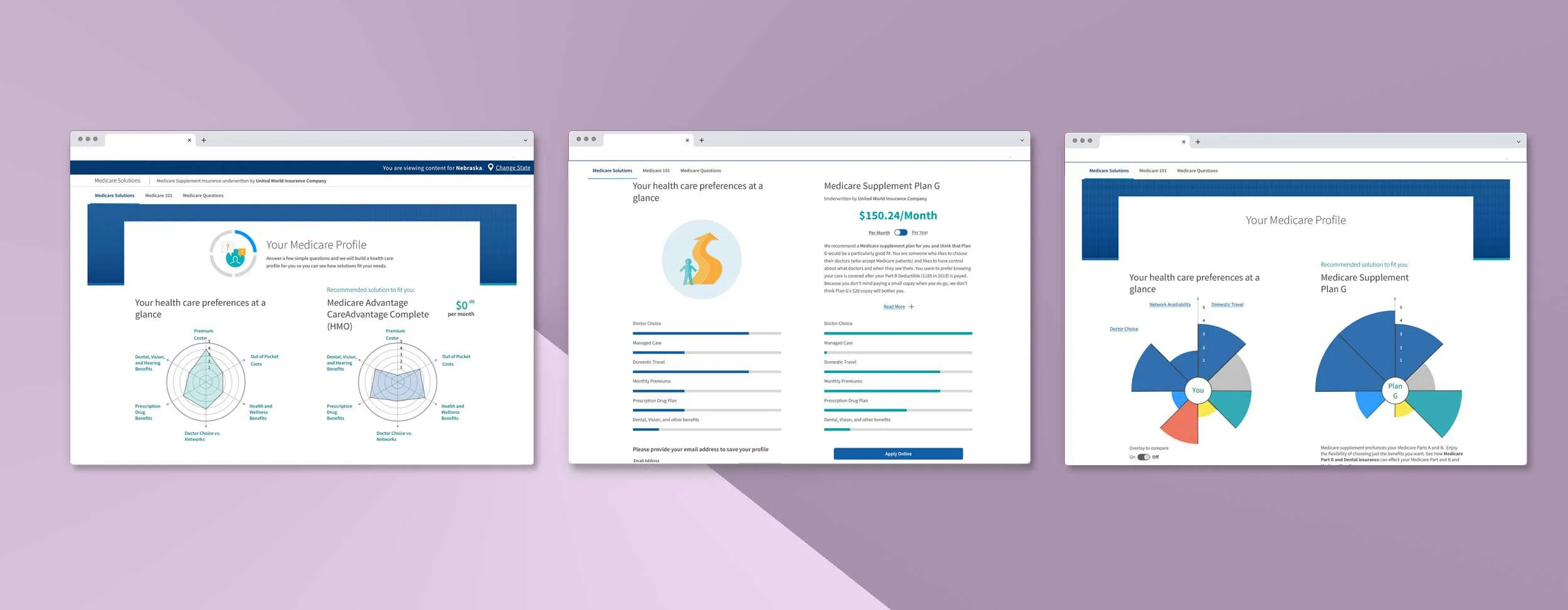
Above you see different types of comparison styles we tested with users
Quotes.
“I don’t see why these questions matter. It feels like I’m being pushed toward a plan instead of choosing one.”
— First Time Medicare Shopper
“My health isn’t black-and-white, but these questions are. It doesn’t feel like it understands what really matters.”
— Supervising Team Lead
These insights highlighted a clear pattern: users needed more context, more flexibility, and more transparency than the legacy tool could provide.
Key Insights
Understanding Today to Design Tomorrow
Research showed that the Advice Center had to deliver transparency and flexibility. These principles shaped the design, the recommendation logic, and the supporting marketing strategy.
1. Simplicity Builds Confidence
Users consistently chose straightforward visual patterns (like the bar graph) over more “sophisticated” options. Clarity always outperformed cleverness.
2. People Don’t Think in Yes/No
Nuanced, ranked inputs gave users the ability to express what truly mattered — costs, medications, doctors, coverage — and feel understood in return.
3. Transparency Drives Trust
Users were far more confident when they could see why a plan was recommended, including weighted factors and explanations.
4. Re-Engagement Is Critical
Personalized emails and follow-up reminders brought users back in ways the legacy tool never enabled, turning the Advice Center into a sustained engagement channel.
5. Friction Kills Momentum
Every unnecessary click, scroll, or mental calculation weakened trust and completion rates. Reducing friction became a design mandate.
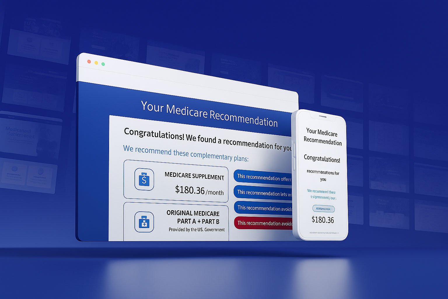
The Solution
Transparency and Trustworthiness
Together, these solutions transformed the Advice Center from a rigid, opaque questionnaire into a transparent, human-centered experience that supported real decision-making. The redesigned system clarified choices, increased user confidence, and aligned every touchpoint — from questions to recommendations to follow-up messaging — around clarity, trust, and long-term engagement.
A Clear, Readable Plan Comparison
- Introduced a simple bar-graph scoring system
- Enabled side-by-side comparison of top recommended plans
- Added transparency by showing why other plans weren't recommended
- Reduced cognitive load and strengthened user trust
This comparison model gave users instant clarity by showing exactly how each plan aligned with their stated preferences. By making alternative plans visible—and explaining why they weren't top recommendations—we introduced transparency that strengthened trust and supported confident decision-making.
A Personalized Profile Builder
- Captured nuanced preferences rather than rigid binary choices
- Explained why each question mattered
- Created a strong foundation for accurate, transparent recommendations
The reimagined questionnaire helped users feel understood by allowing them to express real priorities—not forced yes/no answers. This foundation made the recommendation engine feel more tailored, credible, and aligned to what users actually cared about.
A Human-Centered Recommendation Framework
- Positioned recommendations with clear reasoning ("Because you said X…")
- Added explainers for cost, coverage, medications, doctors, and benefits
- Supported deeper exploration to evaluate alternatives
- Increased trust by reducing surprises and making logic visible
By clearly explaining how the algorithm weighed different factors, we made the logic behind each recommendation feel honest and intuitive. Users could explore alternatives without losing context, reducing anxiety and building a stronger sense of control.
A Re-Engagement Ecosystem
- Personalized email journeys based on user inputs and progress
- Reminder prompts for incomplete sessions
- Social retargeting aligned with the Advice Center value proposition
- Turned the tool into a sustained engagement channel
The addition of personalized email journeys, reminders, and retargeting transformed the Advice Center from a one-time interaction into an ongoing relationship. This created meaningful returns for upper-funnel customers and significantly increased repeat engagement.
Implementation-Ready Prototype & Development Support
- Delivered a fully interactive Axure prototype mirroring real logic and scoring
- Paired with development-ready workflows and user stories
- Provided design QA and behavioral guidance throughout implementation
- Ensured the final build reflected the intended experience
The high-fidelity prototype acted as a single source of truth for engineering, ensuring every interaction, logic rule, and flow was accurately understood. Paired with development-ready stories and design QA support, it helped the final product ship with clarity, quality, and fidelity to the intended experience.
Impact
The redesigned Advice Center drove measurable gains in trust, engagement, and conversion.
Higher Conversions
The redesigned Advice Center drove 66% higher conversion compared to the legacy quote tool, becoming the company’s most profitable digital acquisition path.
Increased Trust & Understanding
A simplified comparison model and clearer explanations led to a 71% higher completion rate, reducing confusion and strengthening user trust.
A Foundation for Future Growth
The Advice Center became a cornerstone for future digital Medicare strategy, with a clear roadmap handed to future teams.
More Return Visitors
Improved clarity and follow-up journeys significantly increased repeat engagement. 54% of users returned to continue exploring their Medicare options.
Stronger Marketing Performance
Email and social alignment delivered measurable lift. Campaigns supporting the Advice Center reached a 21% click-to-open rate, well above industry benchmarks.
Compliance & Innovation
The new framework met WCAG 2.0 AA accessibility standards and pushed teams to rethink internal compliance processes—ultimately creating a stronger, more modern review model.
Reflections
Designing for Trust
This project reminded me that even the most complex decisions can feel simple when the experience is grounded in clarity, honesty, and empathy. It remains one of my clearest examples of turning regulatory and technical constraints into something genuinely human.
Key lessons:
Simplicity earns trust. The obvious solution (the bar chart) was ultimately the right one.
Let go of precious ideas. Round after round of testing challenged assumptions and pushed the experience toward clarity.
Build the MVP, not the dream. Strong foundations create room for evolution.
Use the right tool for the right challenge. Learning Axure was critical in making the prototype accurate enough to validate.
Cross-functional partnership matters. Marketing, engineering, data, and compliance all contributed to a successful launch.
This case study remains one of my clearest examples of transforming complex, regulated content into an experience that feels simple, clear, and human.