Case Study:
A Content Platform Built for Scale
The Fortune 300 Insurance company needed a CMS capable of supporting personalized, compliant experiences across hundreds of product and state variations — something no vendor platform could deliver without heavy customization and long-term technical debt. MondrianCMS was designed to solve this: a sustainable, component-based platform that dramatically accelerated content creation, reduced engineering dependency, and ensured every page could adapt intelligently to complex business rules.
I served as the design architect and lead UX designer, shaping the system’s UX, component framework, governance model, and editor experience. While the primary goal was business acceleration, a key part of the strategy was making the CMS simple enough for junior designers and marketers to use confidently — ensuring the system would scale and endure.
Overview.
The Challenge.
A Modern Website With No Modern Way to Maintain It
Extreme Content Variability
Pages needed to adapt to state, product, underwriting company, and distribution channel, resulting in dozens of required variations for a single page — all with different compliance requirements.
Compliance & Accessibility Burden
Every experience needed to meet WCAG 2.0 AA and strict Medicare/insurance compliance rules. Without guardrails, the risk of error was high.
No Existing CMS Met the Needs
Previous tools (IBM WCM, SharePoint, WordPress, external vendors) required deep customization or quickly became outdated, making even basic updates costly and slow.
Powerful System, Poor Usability
While the headless Drupal + faceted JSON system was technically robust, the UI was confusing, brittle, and inaccessible to anyone except engineers — limiting the organization’s ability to scale.
Inconsistent Design Patterns
Years of patchwork updates left the organization with hundreds of divergent components, creating usability issues for content creators and maintainability issues for engineering.
Compliance + Vendor Misalignment
The vendor didn’t understand the compliance landscape, which forced the team toward oversimplified, risk-averse designs. This stifled innovation and weakened the overall experience.
Addressing these challenges required strong UX leadership working hand-in-hand with engineering architecture to transform complex back-end logic into a clear, intuitive authoring experience.
Team Structure.
My Role — UX Visual Architect
I led the UX strategy and design architecture for MondrianCMS, balancing hands-on design with system-level thinking. My work included:
My role centered on three things:
Defining the editorial model, UX architecture, and contribution governance
Redesigning the CMS UI to simplify workflows, taxonomy, and versioning
Creating reusable templates and components capable of supporting all business variations
Auditing and consolidating 100+ divergent UI patterns into a unified, scalable system
Partnering with engineering to align ontology, roles, workflows, and ADA compliance
Building documentation, training, and support materials for long-term adoption
Driving a roadmap with Product and Engineering to deliver features in sustainable phases
My goal was to turn a technically capable system into a usable, governed platform that accelerated how quickly teams could build compliant, personalized pages.
Team Composition
Experience & Architecture
Lead UX Designer & Design Architect (me)
UX Development Architect (technical strategy, platform roadmap, and integration leadership)
Senior UX Developer (component build + interaction fidelity)
UX Developer (front-end implementation)
Junior UX Designer (workflow testing, ADA support)
Executive Stakeholders
Marketing VP of Digital Experiences (project sponsor)
Product Owner (roadmap prioritization + stakeholder alignment)
Marketing stakeholders (content strategy + authoring needs)
Compliance partners (Medicare + product regulatory review)
Digital Strategy leadership (funding + long-term governance)
We operated as a tightly integrated cross-functional team — essential for turning complex requirements into a system that felt simple and intuitive.
Approach
Our strategy combined foundational system design, UI modernization, and component-driven thinking:
Discover & Define (System Audits + Needs Assessment)
Conducted interviews with marketers, designers, engineers, and compliance
Audited the entire CMS, Drupal back end, and content repository
Identified critical gaps in usability, governance, and ADA support
Mapped business requirements around personalization, compliance, and state variation
Output: A clear target state and two-year roadmap aligned across Design, Product, and Engineering.
Architectural Blueprint (Governance + Editorial Model)
Defined taxonomy, ontology, naming conventions, and reusable data models
Created a contribution process for new components
Established review workflows, approvals, and ownership roles
Output: A sustainable system that content creators could understand and engineering could maintain.
UI Modernization & Workflow Redesign
Rebuilt the CMS interface around intuitive flows
Simplified page creation, versioning, and faceted content application
Introduced in-line content editing to replace nested modals
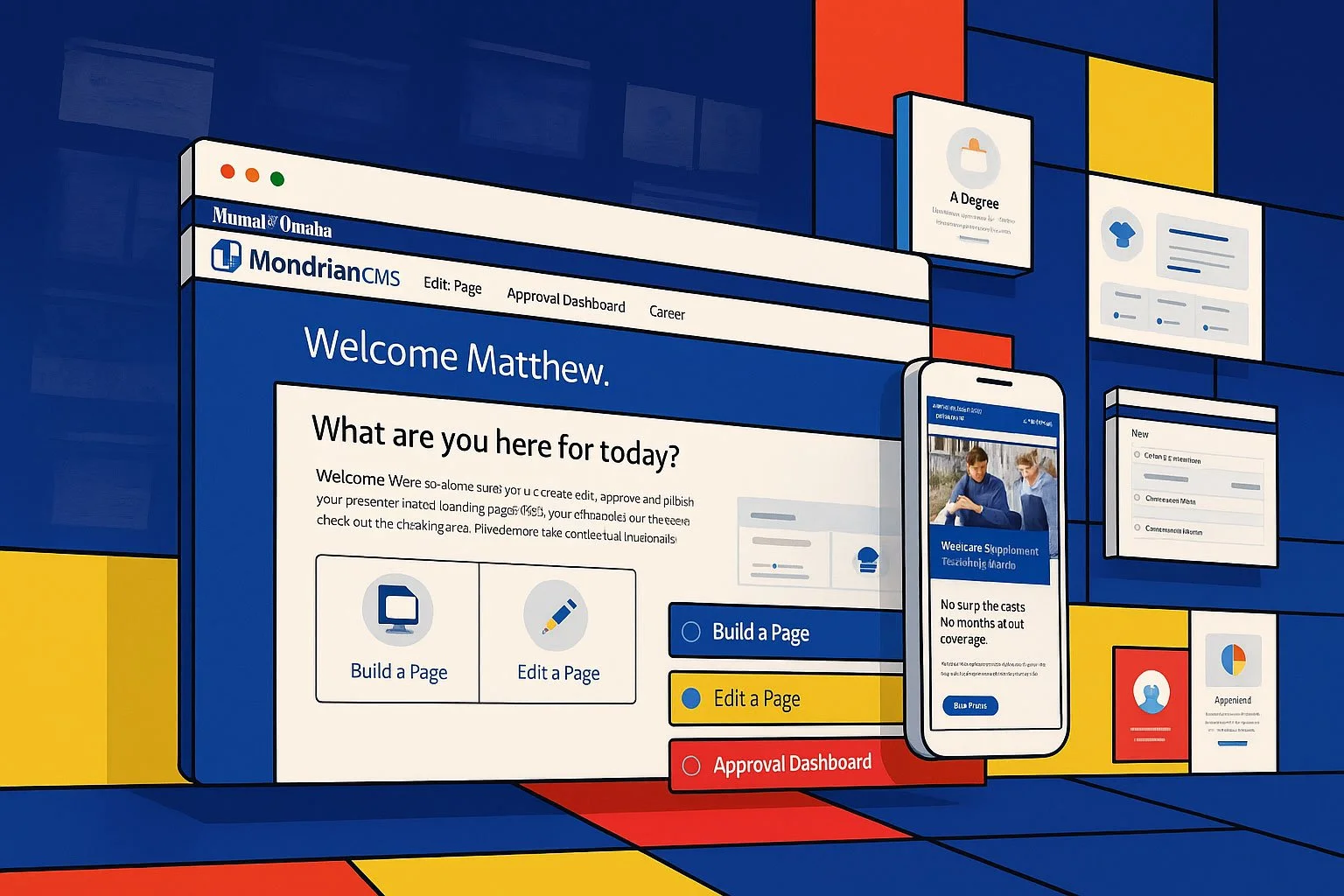
Designed a welcome dashboard for context and onboarding
Output: A CMS that junior designers and marketers could use confidently without engineering support.
Unified, Accessible Component System
We translated the vision into a production-ready experience supported by a complete engagement ecosystem.
Delivered high-fidelity prototypes with full logic and workflows
Created development-ready user stories and acceptance criteria
Partnered with compliance to establish a sustainable approval process
Collaborated with marketing to build supporting email journeys and re-engagement
Output: Faster production, cleaner code, radically reduced tech/design debt, and ADA-compliant pages delivered by default.
Platform Ecosystem & Support
Created training materials, glossaries, and a component catalog
Built ProjectBuilder — a starter kit that scaffolded new projects in minutes
Enabled faster developer onboarding and more reliable handoff
Output: A platform that scaled beyond UX and persisted long after handoff.
To guide and validate our approach, we grounded every major decision in user research and behavioral data.
Research & Key Insights
Understanding the System Through Research
Our research revealed where authors struggled, where the system broke down, and what would be required to make a complex CMS feel clear, consistent, and usable.
Research Activities
- Usability testing of early CMS UI (page creation, versioning, editing flows)
- Interviews with designers, engineers, marketers, and compliance officers
- Card-sorting and taxonomy testing to align mental models
- Observation sessions with junior designers to validate workflows
- Comparative evaluations of vendor CMS platforms
What We Learned
Users needed clarity, not power.
The existing UI overwhelmed authors with technical decisions that didn’t match their responsibilities or mental models.
Taxonomy and naming were major blockers.
Authors hesitated to choose components or facets because terminology was inconsistent and unclear.
Versioning was conceptually powerful but practically confusing.
Users struggled to understand how their changes would propagate across state, product, and channel variations.
Governance had to be built in—not taught.
Without guardrails, authors inadvertently created fragmentation and inconsistencies across experiences.
UI changes had an outsized impact on adoption.
Small interaction improvements—inline editing, exposed actions, onboarding—dramatically increased confidence and speed.
The clarity we gained from research became the foundation for a two-year roadmap that aligned design, product, and engineering.
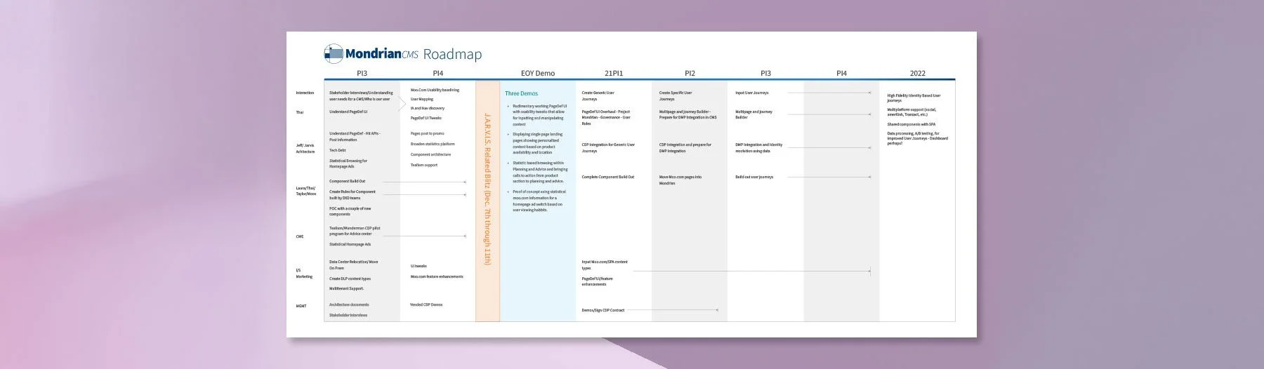
This was our prioritized two year roadmap
Design Principles
Design Principles That Shaped the Platform
These principles grounded the platform in consistency and sustainability. They helped translate complex business rules into a CMS that teams could use confidently without creating new debt or fragmentation.
Clarity Over Complexity — Only show what authors need when they need it.
Create Once, Reuse Everywhere — Components and content must scale effortlessly.
Guardrails, Not Gatekeeping — Bake in compliance, ADA, and governance rules.
Consistency Accelerates Delivery — Templates and patterns reduce decision fatigue.
Design for the Beginner, Support the Expert — A CMS should feel intuitive on day one and powerful on day 100.
What we delivered
Our Solutions
MondrianCMS transformed a fragmented, developer-dependent system into a scalable content platform anyone could use with confidence. By unifying components, templates, workflows, and governance, we created a CMS that delivered power without complexity and stability without sacrificing flexibility. The result was a foundation that empowered creators, protected consistency, and accelerated delivery across every corner of the digital ecosystem.
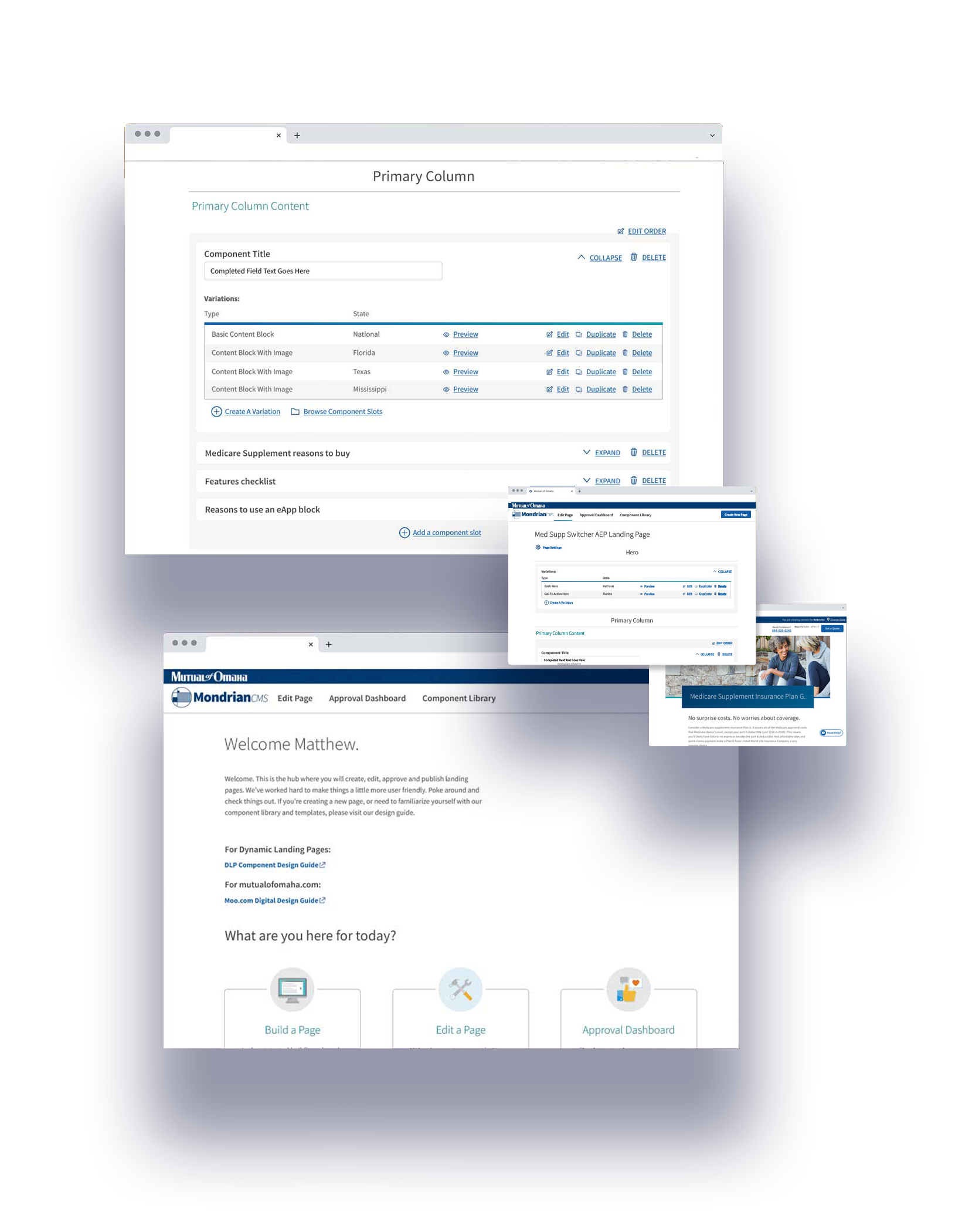
A Component-Based CMS Built for Scale
- 17 reusable components covering 100% of page needs
- Designed for 5 breakpoints with ADA compliance built in
- Governed contribution model to prevent pattern drift
- Result: Faster production, consistent UX, and dramatically lower tech debt
This system transformed a tangle of inconsistent patterns into a flexible library that anyone could use with confidence. Standardizing components across all breakpoints—and embedding accessibility by default—made Create Once, Reuse Everywhere an operational reality. The governed contribution model kept growth stable and high-quality, reinforcing Consistency Accelerates Delivery and Guardrails, Not Gatekeeping.
A Modernized CMS Interface
- Simplified page creation flows
- Inline editing instead of nested modals
- Exposed action menus for faster editing
- Versioning tools reimagined for clarity
- Result: Junior designers could build complex, multi-state pages confidently and quickly
The redesigned UI replaced hidden actions and confusing modals with clear, intuitive interactions that matched how authors actually work. These improvements lowered the learning curve and made the system feel modern and predictable, aligning with Clarity Over Complexity and Design for the Beginner, Support the Expert.
Faceted Content Engine (State + Product + Channel Logic)
- Automated personalization through JSON-driven facets
- Content variations generated without developer intervention
- Support for 50+ page permutations when needed
- Result: Content teams could maintain hyper-targeted experiences without engineering lift
The faceted content engine enabled personalization at scale without requiring any code changes. Authors could manage dozens of variations with confidence thanks to built-in structure and guidance—a balance of Create Once, Reuse Everywhere and Design for the Beginner, Support the Expert. Guardrails ensured personalization stayed fast, safe, and compliant.
Templates & Editorial Workflows
- Templates aligned with the component system
- Approval workflows and notifications for compliance
- Version control built directly into the creation process
- Result: Faster, safer publishing with fewer errors and lower compliance risk
Templates and workflows connected the CMS to real-world governance needs, helping teams publish quickly without sacrificing accuracy. These structures made consistency the default and reduced compliance risks, aligning with Guardrails, Not Gatekeeping, Consistency Accelerates Delivery, and Clarity Over Complexity.
Ecosystem Support Tools
- ProjectBuilder scaffolding tool
- Full documentation, glossaries, and component catalog
- Training for designers, marketers, and developers
- Result: High adoption and long-term sustainability across teams
These support tools transformed MondrianCMS into an end-to-end platform, making onboarding faster and enabling even new or junior contributors to build high-quality pages from day one. This reinforced Design for the Beginner, Support the Expert and Consistency Accelerates Delivery by giving all teams a shared language and structure.
Impact
Streamlined, Compliant, and Built to Scale
Massively Faster Page Creation
What once took months could now be designed, tested, and built in a single sprint — often in hours instead of weeks.
Consistency & Compliancy
ADA compliance, component guardrails, and workflow governance ensured every page shipped consistently and safely.
Reduced Dev Dependency
Designers and marketers could build pages independently, freeing engineers to focus on higher-value product work.
Lower Maintenance & Tech Debt
A unified component system reduced fragmentation across teams and made future changes far more predictable.
Scalable for What’s Next
The faceted content system positioned the company for future personalization initiatives with minimal rework.
Reflections
Designing for Trust
This project reinforced how impactful system design can be when it empowers non-technical teams to create with confidence. MondrianCMS became a bridge between business needs, regulatory constraints, and user experience — proving that clarity, consistency, and strong governance unlock delivery at scale. It remains one of my strongest examples of designing infrastructure that accelerates an entire organization.
Key lessons:
Good systems make expertise optional. When the interface reduces cognitive load, anyone — not just specialists — can build high-quality pages.
Governance must be built in, not bolted on. Guardrails in the CMS prevented fragmentation far more effectively than documentation alone.
Clarity accelerates delivery. Clean taxonomy and intuitive workflows allowed teams to work faster with fewer mistakes.
Design and engineering alignment is everything. Deep partnership with development ensured the CMS was both powerful and maintainable.
Reuse multiplies value. A strong component system reduced tech debt, improved performance, and made personalization scalable.
Solve for the junior user first. Designing for the least experienced author ensured the system remained intuitive for everyone.
This project also became one of the most meaningful partnerships of my career. Working side-by-side with engineering architecture taught me that great UX isn’t just about designing elegant interfaces — it’s about understanding feasibility, shaping the underlying systems, and building solutions that are as technically sound as they are intuitive.